A frustrating issue in front-end development and graphic design is receiving images that stretch or squish on responsive screens. Distortion occurs because the image dimensions do not match the aspect ratio of the container, forcing the browser to warp the pixels to fit.
If you need to calculate pixel dimensions quickly without registering accounts, signing up for newsletters, or hitting paywalls, FluxToolkit has built a client-side solution. Our picture size ratio calculator is 100% free, private, and runs entirely in your web browser.
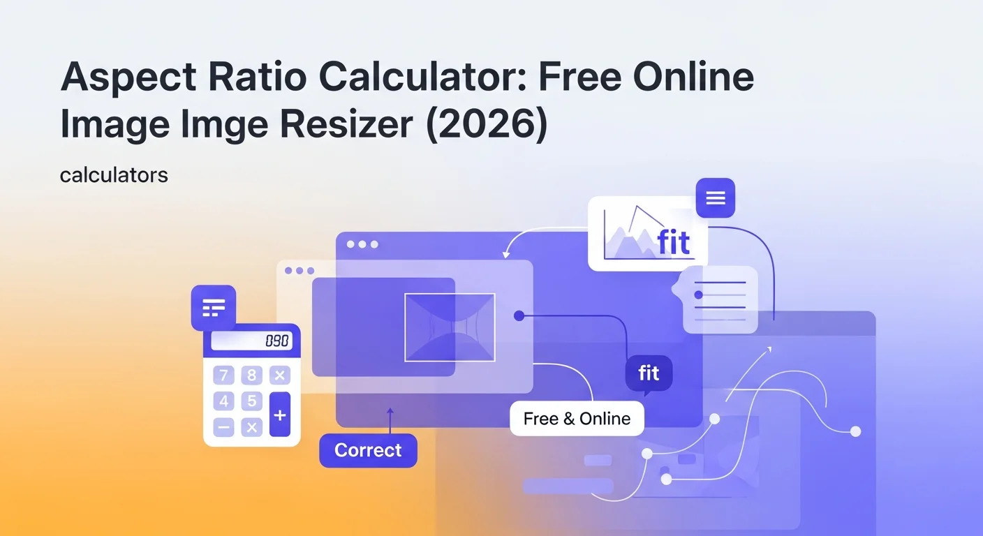
Aspect Ratio Calculator
Calculate width, height, or ratio from any two values. Supports common presets like 16:9, 4:3, and 1:1 with a visual preview.
What Is an Aspect Ratio?
An aspect ratio is the proportional relationship between the width and height of an image, video, screen, or container. It is written as two numbers separated by a colon (Width:Height). For example, a 16:9 ratio indicates that for every 16 units of width, there are 9 corresponding units of height.
It is crucial to understand that aspect ratio is independent of actual size. An image that is 1920x1080 pixels and an image that is 1280x720 pixels both have a 16:9 aspect ratio, despite having different total resolutions.
Why Use a Picture Size Ratio Calculator?
Whether you are editing digital photographs, uploading posts to social media, or coding a responsive design system, using a picture size ratio calculator prevents unwanted stretching. Proportional scaling allows you to:
- Prevent Pixel Distortion: Maintaining the exact width-to-height ratio ensures faces, products, and typography are rendered without warping.
- Standardize Canvas Sizes: Instantly compute dimensions for standard prints (like 4"x6" or 8"x10") or canvas presets.
- Speed Up Web Rendering: Resizing images to match container ratios reduces layout shifts (CLS) and boosts overall page loading speed.
The Mathematics of Aspect Ratio: Scaling and Simplification
Our aspect ratio calculator uses two distinct mathematical operations to maintain layout proportions.
Formula 1: Calculating Missing Dimensions (Scaling)
When you want to resize an image while maintaining its original proportions, you must scale the dimensions:
- Calculating Height: Given a target width and the aspect ratio ($W:H$):
$$\text{Height} = \text{Width} \times \left(\frac{H}{W}\right)$$
- Calculating Width: Given a target height and the aspect ratio ($W:H$):
$$\text{Width} = \text{Height} \times \left(\frac{W}{H}\right)$$
Example: You want to scale an image with a 16:9 ratio to fit a container with a width of 800 pixels.
- Height = 800 × (9 / 16) = 800 × 0.5625 = 450 pixels.
- The scaled dimensions are 800x450 pixels.
Formula 2: Simplifying a Ratio (GCD Math)
To find the simplified ratio from raw dimensions (e.g. 1920x1080), you must calculate the Greatest Common Divisor (GCD) of the two numbers. The calculator uses the Euclidean algorithm:
$$\text{GCD}(a, b) = \text{if } b = 0 \text{ then } a \text{ else } \text{GCD}(b, a \bmod b)$$
Once the GCD is found, divide both the width and height by this number to get the simplified ratio:
$$\text{Simplified Width} = \frac{\text{Width}}{\text{GCD}}$$
$$\text{Simplified Height} = \frac{\text{Height}}{\text{GCD}}$$
Example: Simplify the resolution 1920x1080.
- GCD(1920, 1080) = 120
- Simplified Width = 1920 / 120 = 16
- Simplified Height = 1080 / 120 = 9
- The aspect ratio is 16:9.
Standard Aspect Ratio Reference Table (2026 Update)
Modern digital media uses several standard aspect ratios. Below is the reference table of common screen and image formats:
| Aspect Ratio | Common Use Cases | Standard Resolutions |
|---|---|---|
| 16:9 (Widescreen) | YouTube videos, HD monitors, TV broadcasts | 1920x1080, 1280x720, 3840x2160 |
| 9:16 (Vertical) | TikTok videos, Instagram Stories, YouTube Shorts | 1080x1920, 720x1280 |
| 1:1 (Square) | Instagram feed photos, profile pictures, icons | 1080x1080, 500x500, 150x150 |
| 4:3 (Standard) | Retro televisions, iPad screens, classic photography | 1024x768, 800x600, 640x480 |
| 21:9 (Ultrawide) | Ultrawide computer monitors, cinematic films | 3440x1440, 2560x1080 |
| 3:2 (Classic) | 35mm film photography, Microsoft Surface laptops | 3000x2000, 1500x1000 |
Front-End Developer Cheat Sheet: CSS Aspect Ratio
CSS introduces modern styling properties that allow elements to maintain their aspect ratios responsively in browser code without requiring JavaScript calculations.
The CSS `aspect-ratio` Property
The aspect-ratio property allows you to define a target ratio directly in your CSS classes:
/* Maintain a 16:9 ratio for video cards */
.video-card {
  width: 100%;
  aspect-ratio: 16 / 9;
}
Preventing Image Distortion with `object-fit`
When loading user-uploaded images that do not match your container's aspect ratio, use object-fit: cover to crop the image dynamically rather than stretching it:
/* Crop image to fit container without warping proportions */
.avatar-image {
  width: 100px;
  height: 100px;
  object-fit: cover;
  border-radius: 50%;
}
Step-by-Step: How to Use the Aspect Ratio Calculator
Follow these steps to scale image, screen, or container dimensions:
Step 1: Select Your Calculation Mode
Determine what you want to calculate:
- Find Height from Width: Input an aspect ratio (or select a preset) and the width in pixels to calculate the corresponding height.
- Find Width from Height: Input an aspect ratio (or select a preset) and the height in pixels to calculate the corresponding width.
- Find Ratio from Dimensions: Input both width and height dimensions to calculate the simplified ratio.
Step 2: Input Your Variables
Type your values into the text inputs on-screen. The tool processes entries dynamically as you type.
Step 3: Use Presets for Quick Setup
Click on the preset buttons (such as 16:9, 9:16, or 1:1) to automatically populate target ratios when scaling dimensions.
Step 4: Verify Your Output
Review the results summary block. The calculator displays the computed width or height, the simplified ratio, and a visual preview box showing the shape of the aspect ratio.
Privacy Note
Image assets, dimensions, and project design parameters should remain private. FluxToolkit processes everything entirely within your browser using client-side JavaScript. Your numeric entries, dimension values, and results are never transmitted to our servers, stored in a database, or used to train any model. It stays on your device.
Frequently Asked Questions
What happens if I stretch an image instead of cropping it?
If you resize an image's width and height independently without maintaining its aspect ratio, the pixels will stretch or squish, distorting the contents. Faces will appear elongated or compressed, and graphics will lose their geometric shapes. Use aspect-ratio constraints or cropping to prevent this.
Why is 16:9 the universal standard for video?
16:9 became the standard for high-definition television and digital screens in the late 2000s because it represented a compromise between traditional 4:3 TV screens and widescreen cinematic formats (like 2.39:1). This minimized black bars (letterboxing) on both formats.
How do I calculate the aspect ratio of a screen?
To calculate a screen's aspect ratio, divide the horizontal resolution by the vertical resolution. For example, a 4K screen with a resolution of 3840x2160 pixels divided by its GCD (240) yields 16 and 9, which represents a 16:9 aspect ratio.
What is the difference between letterboxing and pillarboxing?
Letterboxing occurs when black bars are added to the top and bottom of an image or video to fit a wider screen (e.g. playing a cinema movie on a 16:9 TV). Pillarboxing occurs when black bars are added to the sides of an image to fit a narrower screen (e.g. playing a 4:3 video on a 16:9 TV).
Can I calculate fractional aspect ratios?
Yes. Our calculator handles decimals and fractions. If you are working with non-standard canvas dimensions or custom device interfaces, input the exact pixel values, and the tool will compute the precise fractional scaling ratios.