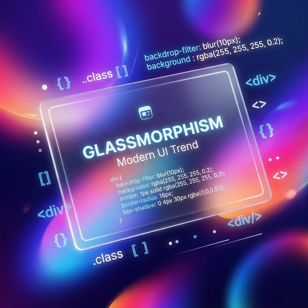
Glassmorphism continues to dominate web and app design in 2026. Initially popularized by macOS Big Sur and iOS, the "frosted glass" aesthetic adds depth, hierarchy, and a premium feel to modern user interfaces by allowing vibrant background colors to softly blur and shine through foreground elements.
However, writing the CSS to achieve the perfect glass effect from scratch can be a tedious process of trial and error. Balancing opacity, blur radius, and edge lighting requires constant tweaking.
In this guide, we will break down the core CSS properties required for Glassmorphism, how to implement it using Tailwind CSS, and how you can use our free generator to instantly build the perfect component.
The Anatomy of Glassmorphism
To create a realistic frosted glass effect, you cannot simply lower the opacity of an element. Lowering opacity makes the entire element (including the text inside it) transparent, which ruins readability.
Instead, true Glassmorphism relies on four distinct CSS properties working in harmony:
1. The Backdrop Filter (`backdrop-filter: blur()`)
This is the engine of the glass effect. The backdrop-filter property applies graphical effects (like blurring or color shifting) to the area behind an element.
2. Semi-Transparent Background (`rgba()`)
For the blur to be visible, the element itself must have a semi-transparent background color. Usually, a white background with 10% to 40% opacity (rgba(255, 255, 255, 0.2)) works best for Light Mode, while a dark, semi-transparent black works for Dark Mode.
3. The "Catch Light" Border
Physical glass catches light on its edges. To mimic this, you must add a 1px solid border with a very low opacity (e.g., border: 1px solid rgba(255, 255, 255, 0.2)). This defines the edge of the element and separates it from the background.
4. Drop Shadow
A soft, wide drop shadow (box-shadow) lifts the glass panel off the background, enhancing the 3D depth of the interface.
Implementing Glassmorphism with Tailwind CSS
Tailwind CSS makes building glassmorphic components incredibly fast through its utility classes. Here is the standard recipe for a Tailwind glass card:
<div class="backdrop-blur-md bg-white/30 border border-white/20 rounded-2xl shadow-lg p-8">
  <h2 class="text-xl font-bold text-white">Glassmorphism Card</h2>
  <p class="text-white/80">This text remains fully opaque and readable!</p>
</div>
Breaking Down the Tailwind Classes:
backdrop-blur-md: Applies a medium blur to the background. (You can use-sm,-md,-lg, or-xldepending on the desired frost level).bg-white/30: Applies a white background with 30% opacity.border border-white/20: Adds a 1px border with 20% opacity for the edge lighting.rounded-2xl: Glassmorphism almost always requires rounded corners to look modern.shadow-lg: Provides the depth.
The Secret to Good Glassmorphism: The Background
The biggest mistake developers make when attempting Glassmorphism is placing the glass card on a solid white or solid gray background.
Glassmorphism requires a colorful, dynamic background to work. If the background behind the card is a flat #F3F4F6, the backdrop-filter: blur() will have nothing to blur, and your card will just look like a muddy, semi-transparent gray box.
Always place glass components over:
- Vibrant, multi-colored CSS gradients.
- High-quality photographic backgrounds.
- Abstract 3D shapes or blobs.
Automate It: The CSS Glassmorphism Generator
If you are tired of guessing the exact RGB values and blur radiuses, you can automate the entire process using the FluxToolkit CSS Glassmorphism Generator.
Features of the Generator:
- Live Preview Environment: Adjust the blur, opacity, and color using visual sliders while seeing the effect update in real-time over a colorful background.
- Vanilla CSS Export: Instantly copy the raw, cross-browser compatible CSS (including the necessary
-webkit-prefixes for older Safari support). - Tailwind CSS Export: Are you using Next.js or React? Toggle the output to Tailwind, and the generator will output a single string of utility classes (including arbitrary values like
bg-[rgba(255,255,255,0.15)]if you need extreme precision).
Accessibility (a11y) Considerations
While beautiful, Glassmorphism can present severe accessibility issues if not implemented carefully.
Because the background color of the glass card changes depending on what is behind it, the contrast ratio of the text inside the card can fluctuate wildly.
Best Practices for Accessibility:
- Never rely solely on the blur to create contrast. If your text is white, ensure the background of the glass card is dark enough (or the background image behind the card is dark enough) to maintain a minimum 4.5:1 contrast ratio.
- Provide a fallback background color for browsers that do not support
backdrop-filter(though support is near 97% globally in 2026). - Avoid placing critical, small-font text over highly erratic, high-contrast background images, even with a blur applied.
*Stop writing tedious CSS by hand. Build your next modern UI component instantly using our free CSS Glassmorphism Generator.*