If you have ever spent hours meticulously editing a TikTok video in Premiere Pro or CapCut, only to upload it and realize the "Like" button completely covers your punchline, you have experienced the frustration of ignoring the TikTok Safe Zone.
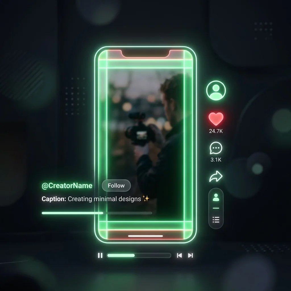
The user interfaces of short-form video platforms—TikTok, Instagram Reels, and YouTube Shorts—are incredibly cluttered. Between the creator's username, the caption text, the scrolling music ticker, and the right-side engagement rail (Like, Comment, Save, Share), nearly 30% of your 9:16 screen is a danger zone for on-screen text.
In this guide, we will break down the exact dimensions of the 2026 TikTok Safe Zone, explain the "center-middle" philosophy, and show you how to use our free simulator to guarantee your text is never blocked again.
Understanding the 2026 TikTok Danger Zones
TikTok videos are universally exported at a 1080 x 1920 pixel (9:16) resolution. While your video takes up the entire screen, the UI elements sit on top of your content.
If you place hardcoded subtitles, logos, or crucial visual information in these areas, they will be obscured:
1. The Bottom Zone (The Most Dangerous)
The bottom 20-25% of the screen is where videos go to die. This area houses your profile name, the video description, hashtags, and the music ticker. The danger here is that this zone expands. If you write a massive, 3-paragraph caption, TikTok will push that text higher up the screen, consuming even more of your video space.
2. The Right Rail (Interactions)
The right edge of the screen (about 120-150 pixels wide) contains your profile picture, the heart icon, the comment bubble, the save ribbon, and the share arrow. Avoid placing faces or reading text on the far right edge of your video.
3. The Top Band (Navigation)
The top 10-15% of the screen contains the "Following | For You" toggles and the Search/Live icons. While less intrusive than the bottom zone, placing text here often clashes with the UI and makes the video look amateurish.
The "Center-Middle" Philosophy
Because the TikTok interface is dynamic (meaning it shifts based on device size, caption length, and whether you are running an Ad format with a CTA button), there is no single mathematically perfect "Safe Zone."
Instead, professional editors design around the Center-Middle Philosophy.
You should aim to keep all critical text, stickers, and the main subject of your video within a central 900 x 1400 pixel bounding box, heavily biased toward the middle-left of the screen.
If you follow a strict rule of thumb, you should avoid:
- The Top 15%
- The Bottom 25%
- The Right 15%
How to Preview Your Video Before Publishing
Instead of guessing if your text is in the clear, you can simulate exactly how it will look on a user's phone before you hit publish.
We built the free TikTok Safe Zone Simulator specifically for video editors, social media managers, and creators.
Using the Simulator:
- Export your Draft: Export a draft of your video (or take a screenshot of a frame containing your hardcoded subtitles).
- Upload: Drag and drop the file directly into our Simulator tool. The tool runs entirely in your browser (no uploading required), so it processes instantly and keeps your unreleased content private.
- Adjust the Overlay: The tool will instantly overlay the standard TikTok UI elements and a glowing red "Danger Zone" mask over your video.
- Analyze & Fix: If your text falls under the red mask, go back into your editing software, nudge the text up or to the left, re-export, and check it again.
Why Not Just Use TikTok's Native Text?
You might be wondering, "If I just type my text using the TikTok app, it automatically stops me from putting it out of bounds. Why not just do that?"
While using native text is a great, safe strategy for casual creators, professional creators and brands almost exclusively use third-party software (Premiere Pro, DaVinci Resolve, CapCut Pro).
Why? Because native text is incredibly limited. You cannot easily keyframe text to track movement, you are limited to a small handful of fonts, you cannot import brand-specific typography, and you cannot easily build complex motion-graphics. Furthermore, if you want to upload the same video to Instagram Reels and YouTube Shorts, you have to type the text out natively three separate times.
By "baking in" your subtitles using editing software, you create a single, high-quality asset that can be distributed everywhere. You just need to ensure it adheres to the Safe Zone!
Frequently Asked Questions
Does the TikTok Safe Zone apply to Instagram Reels?
Yes! While the exact pixel dimensions of the buttons differ slightly, the overall layout of Instagram Reels and YouTube Shorts is almost identical to TikTok. If you keep your text within the center-middle TikTok Safe Zone, it will be perfectly readable on Reels and Shorts as well.
How does the Safe Zone change for TikTok Ads?
TikTok Ads have a much larger danger zone. Ads feature a prominent Call To Action (CTA) button (e.g., "Shop Now" or "Download") positioned directly above the caption. If you are producing ad creatives, you must push your Safe Zone even higher to accommodate the CTA card.
What is the best aspect ratio for TikTok?
Always shoot and export your videos in a 9:16 aspect ratio (1080 x 1920 pixels). If you upload horizontal video (16:9), TikTok will add massive black bars (letterboxing) to the top and bottom of your video, drastically reducing engagement and making your video look unprofessional.
*Stop guessing where your text will land. Preview your next upload right now using our free TikTok Safe Zone Simulator.*