When building a new website or application, content and code rarely arrive at the same time. The development team often needs to build out responsive grids and UI layouts long before the marketing team has finalized the product photography or the design team has finished the illustrations.
Placeholder images are the bridge between wireframes and final deployment. By generating temporary images with exact pixel dimensions, developers can build structurally sound layouts without losing momentum.
This guide covers the best practices for using placeholder image generators, when to use low-fidelity versus high-fidelity placeholders, and how to keep stakeholders focused during design reviews.
Generate a Custom Placeholder Image Instantly
Placeholder Image Generator
Generate custom placeholder images for web design mockups and wireframes.
What is a Placeholder Image?
A placeholder image (sometimes called a "dummy image") is a temporary graphic used to occupy a specific space within a layout. It is used exclusively during the design and development phases and is swapped out for final assets before the project goes live to the public.
Historically, designers would spend hours in Photoshop manually creating gray boxes with text like "800 x 600 Hero Image." Today, placeholder image generators allow you to create these assets instantly, either by downloading a static file or by linking directly to a dynamic URL.
The 3 Stages of Placeholder Fidelity
How you use placeholders should evolve as your project moves from conception to launch.
1. Low-Fidelity (Wireframing Phase)
During the early wireframing stage, the focus is purely on structural hierarchy and user flow.
- The Best Practice: Use the simplest placeholders possible. A plain gray box with a subtle cross through it, or an image that simply states the pixel dimensions.
- Why? If you use compelling photography too early, stakeholders will spend the meeting critiquing the image choices rather than evaluating the layout logic.
2. Mid-Fidelity (Prototyping Phase)
As the layout solidifies, you need to test visual balance.
- The Best Practice: Use custom colors that match your brand palette, and add descriptive labels (e.g., "Team Member Photo" or "Primary Product Shot").
- Why? This helps stakeholders visualize the final product's mood and spacing without committing to specific final assets. It also helps developers understand the exact aspect ratios required for CMS image uploads.
3. High-Fidelity (User Testing Phase)
When you put the prototype in front of actual users for testing, obvious placeholders can be distracting.
- The Best Practice: Phase out the gray boxes. Use "realistic" placeholder photography (like generic landscapes or stock avatars) that feels natural, even if it isn't the final content.
- Why? Users struggle to provide honest usability feedback if an interface feels "fake." Realistic imagery helps them suspend disbelief and interact with the software naturally.
Why Developers Rely on Placeholder Generators
For frontend engineers, placeholder images are an essential development tool for solving three common problems:
1. Preventing Cumulative Layout Shift (CLS)
Cumulative Layout Shift occurs when elements on a web page jump around as images load in. This provides a terrible user experience and negatively impacts Google Core Web Vitals. By inserting placeholder images with the exact intended dimensions into the HTML, developers can ensure the browser reserves the correct amount of space on the page, preventing any jumping once the final images are added.
2. Testing Responsive Breakpoints
Modern layouts must adapt to mobile, tablet, and desktop screens. Developers use placeholders to quickly test how images behave across these breakpoints. Will the 16:9 hero image crop correctly on a vertical phone screen? Generating placeholders of different dimensions allows developers to dial in their CSS object-fit and aspect-ratio rules perfectly.
3. Building CMS Templates
When handing a Content Management System (CMS) over to a client, developers need to set strict image requirements. Placing a generated placeholder that explicitly says "Upload exactly 1200x630 pixels here" directly into the CMS preview prevents the client from uploading improperly sized images that break the layout.
Privacy and Security
The FluxToolkit Placeholder Image Generator operates entirely within your browser using the HTML5 Canvas API. It does not require any server-side processing to generate your custom images. Because it works locally, there are no limits on how many placeholders you can generate, and you can download the results instantly as PNG, JPEG, or WebP files for immediate use in your local development environment.
Frequently Asked Questions
What file format should I use for my placeholders?
For simple text-and-color placeholders, PNG is usually the best choice because it renders the text sharply and has a very small file size. If you are generating massive placeholders for full-screen hero sections, WebP will provide the smallest file size.
Should I use placeholder images in production?
No. Placeholder images are strictly for development, wireframing, and internal staging environments. Serving dummy images to live users looks unprofessional and can confuse search engine crawlers. Always replace placeholders with final, optimized assets before launch.
What is the difference between a placeholder image and a fallback image?
A placeholder image is used during the design and development phase to hold space. A fallback image (or default image) is used in production software when user-generated content fails to load or is missing (e.g., displaying a generic silhouette avatar when a user hasn't uploaded a profile picture).
Can I use custom fonts for the placeholder text?
To ensure the generator works instantly and offline across all devices, our tool relies on clean, standard system fonts (like Arial or system-ui). This guarantees consistent, immediate rendering without requiring heavy font file downloads.
Is there a maximum dimension for generated placeholders?
While you can input any dimensions, extremely large resolutions (for example, above 5000x5000 pixels) require significant browser memory to render on the HTML5 Canvas. For standard web use (up to 4K resolution at 3840x2160), the tool will generate the image instantly.
Related Articles
Lorem Ipsum: The Designer's Guide to Placeholder Text and Why It Works
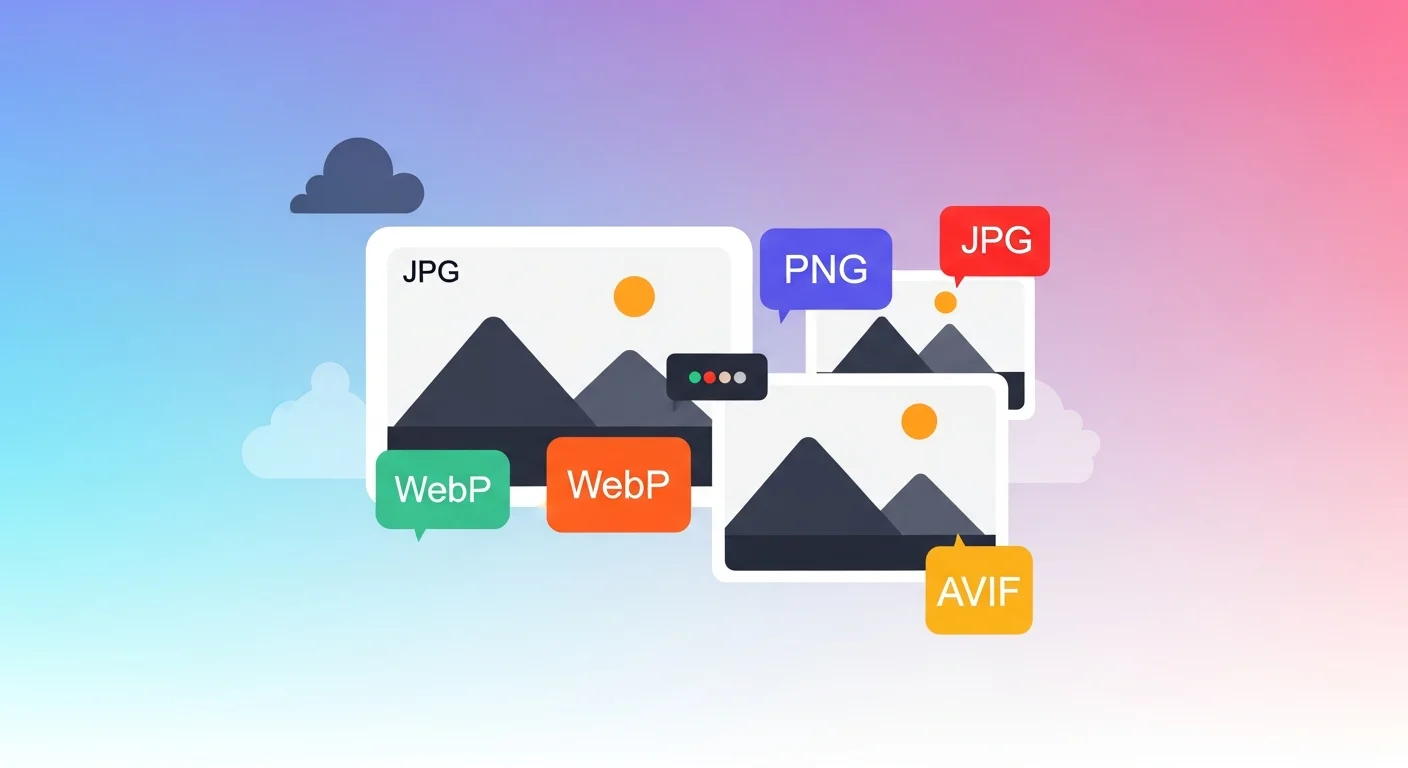
Image Converter: Convert Between JPG, PNG, WebP, AVIF & More

How to Resize an Image Online — Free, Fast, and Without Quality Loss